
Beautiful Examples of Anime UI
How UI contributes to anime narrative, and what we can learn from the underlying UX concept.
UI in Anime is amazing. Partially because it’s overdone, partially because it’s choreographed into a narrative, and partially because the creators detail every pixel to the fullest extent(without business logic to restrain them.) And there’s sound effects! It’s UI created for the sake of *feeling* like UI — intuitive, effective, accessible… all the things that show that a user has achieved mastery of a tool. It’s beautiful. 😢😭👏
I recently stumbled on a tumblr blog documenting Anime UI. While it was cool to see a waterfall of colorful gifs, the content felt unsubstantiated. I wrote this post to explain a few tasty chunks of Anime UI. Starting with their contribution to the anime’s narrative, and then the underly UX concept.
Let’s get started with a favorite:
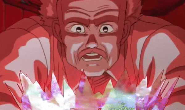
1. Gundam Wing’s ZERO System

Description: The ZERO System suggests military maneuvers to the pilots of weaponized robots. For instance, every possible way to to attack another enemy robot. Although represented physically as an orb (above), the Zero system is interfaced with the user’s brain. Although it presents all possible actions, it’s still the pilot’s responsibility to decide and act.
How it was used as a plot device: In classic anime form, It’s used to exalt the power of keystone characters. Since the ZERO System generates endless options, keystone characters are shown as *superior* for their ability to filter and decide calmly. Weaker characters suffer a period of insanity due to information overload.

Relevant Tech Industry: As a technology that overlays suggestions atop reality, ZERO System is a form of AR.
Relevance to UX: ZERO System displays the endless actions available. Consequently it causes decision fatigue. It shows there are power-users who can can handle information overload, but that the vast majority of users are easily overwhelmed. My personal takeaway: the power-user is rare, but exalted. Don’t design for just for them.
Source: Gundam Wing(E24)
2. NEON Genesis’s VR Meeting Room

Description: A virtual meeting room used for government meetings. The meeting organizer has control of the environment and guests.
How it was used as a plot device: The meeting room is used to display the power dynamic. For example, in the second episode of the first season, Gendo Ikari is shown within the meeting room. We know from context that Gendo is being chastised for going over-budget. The stark lighting in the virtual room makes it easy to focus on the guest’s expressions, and thus better represents the scrutiny directed towards Gendo.
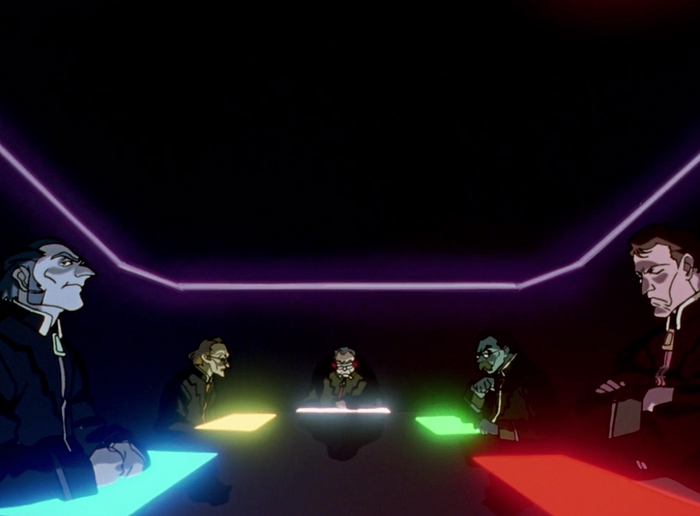
Relevant Tech Industry: Virtual Reality
Relevance to UX: This Anime UX shows the importance of Environmental Ambience. In the future, what will virtual meeting rooms look like? Will we be rendered in sterile rooms to promote focus? Or grassy fields to encourage brainstorming? For any given meeting, what type of virtual room best promotes the purpose? Perhaps this virtual meeting room’s ‘skin’ was chosen by the host to communicate the intent of the meeting.
Source: NEON Genesis Evangelion(S1E2)
3. AKIRA’s Energy Meter
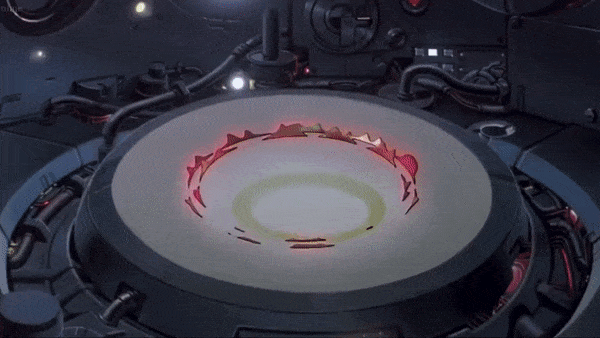
Description: The rings in this holographic represent the energy given off by AKIRA. A form of universal energy. The closer AKIRA is the higher the rings dance and flicker.
How it was used as a plot device: When we first see the meter, the rings move subtly. The negative space around the crown suggests that the readings will grow. This creates a sense of anticipation.
Relevant Tech Industry: Internet of Things(IOT), Data Representation
Relevance to UX: Data Visualization. We often think of data as something we access through a computer, for the purpose of deriving a conclusion. AKIRA’s Energy Meter shows us that data can be an element of interior decor that blurs the line between functional and beautiful.
Source: AKIRA (1:26:32)

To Be Continued
If I misinterpreted anything please let me know. I’m thinking about doing a sequel article, so if you have any favorite Anime UIs, I’d love to turn them into a case study. Please share!
